Website Widgets
Overview
The LMG Web Widget allows you to show dynamic offers on your website easily with a couple of lines of code.
It will display the offers from a collection, or from multiple collections, using a variety of layouts. These offers will track their impressions as reach events in the appropriate business dashboards. When clicked, they will take the viewer to your property's Public Offer Viewer, or redirect appropriately if you have configured redirects.
Requirements
Each widget requires:
- Property Integration Key
- One or more Collection Ids
Supported Browsers
- IE11+ / Edge 17+
- Chrome 49+
- Safari 5.1+ / Mobile Safari 11.3+
- Firefox 69+
- Opera 63+ / Opera Mini 1+
Getting Started
1. Add the Widget Container
Add an element to hold the widget to your page. Make sure to add it on the page where you want the widget to be displayed. If your page structure requires specific elements to enforce width and margins (ie. a specific row or column element structure), ensure that the Widget Container element is added inside the correct element.
By default, the widget is added to an element with an id of lmgOffersWidget. (See Widget Config)
...
<div id="lmgOffersWidget"></div>
...
2. Add Widget Script Tag
Add the correct script tag for the widget type to the bottom of the page body:
<script src="https://widget.loopmediagroup.com/js/1/tiles.js"></script>
3. Add the Widget Configuration
Add the widget configuration to your page:
<script>
  window.lmgWidgetConfig = {
    integration: "<the_integration_key>",
    collection: "<the_collection_id>"
  };
</script>
Customization
The LMG Web Widgets provide various configuration and styling options to customize for a specific web page and use case.
Widget Configuration Options
These are additional keys supported by the window.lmgWidgetConfig options. They allow customization of the widget initialization and behaviour.
| key | description |
|---|---|
| REQUIRED | |
integration | LMG integration key |
| One Of: | |
collection | LMG collection id |
collections | An array of collection configurations (see Combo widget below) |
| OPTIONAL CONFIGURATION | |
element | DOM element reference for mounting (If set, takes precedence over elementSelector) |
elementSelector | DOM selector string for element for mounting (Defaults: "#lmgOffersWidget"). If elementSelector matches multiple elements, the first found will be used. |
display | |
display.header | String to display as widget header |
display.hover.enabled | Show hover effects on offer cards? (Default: true) |
content | |
content.ordering | "random" to shuffle businesses and offers returned; "source" to keep source ordering (Defaults to "random") |
content.filter | Filters the returned content based on type. Valid filters are "exclusive", "limited", or "featured". (Default: null) |
tracking | |
tracking.name | String to add to links as utm_campaign parameter |
tracking.source | String to add to links as utm_source parameter |
client | |
client.geoContext | Optional geographic filtering context object. Allows content to be limited by geographic area or region. |
Styling
In general, the widget will use the sizes and spacing inherited from the parent page's styling, including headings, links, fonts, etc.
For more control, every part of the widget has a specific css class that can be targeted.
Note: All classes are prefixed with lmg-widget_ to avoid affecting the rest of your page.
CSS Classes
| class | description |
|---|---|
| GENERAL | |
.lmg-widget | Base widget container |
.lmg-widget_header | Widget header |
.lmg-widget_section_header | Optional section headers between layouts (Combo Widget only) |
.lmg-widget_footer | Widget footer |
.lmg-widget-radius | Set corner radius on rounded elements |
| LAYOUTS | |
.lmg-widget_tiles | Tile layout containers |
.lmg-widget_carousel | Carousel layout containers |
.lmg-widget_hero-offer | Hero offer layout containers |
| COMPONENTS | |
| Offer Cards | |
.lmg-widget_offer-card | Top-level element for each offer |
.lmg-widget_business__name | |
.lmg-widget_business__logo | |
.lmg-widget_business__category | |
.lmg-widget_offer-card__image | |
.lmg-widget_offer-card__headline | |
.lmg-widget_offer-card__subheadline |
Advanced
Types of Widgets
There are currently 2 widgets available on the platform:
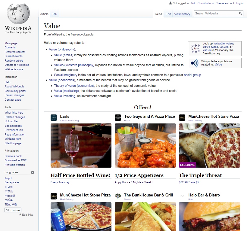
Tile Widget
Lays out up to 9 offers in a responsive grid (see screenshot above).
This widget supports a single collection. It is initialized with the tile.js widget Javascript code:
<script src="https://widget.loopmediagroup.com/js/1/tiles.js"></script>
Combo Widget
An advanced widget that allows multiple layouts and collections to be displayed.
It is initialized with the combo.js widget Javascript code:
<script src="https://widget.loopmediagroup.com/js/1/combo.js"></script>
Configuration
The combo widget allows multiple collections to be specified in it's configuration:
<script>
  window.lmgWidgetConfig = {
    integration: "<the_integration_key>",
    collections: [
      "<collection_1_id>",
      "<collection_2_id>"
    ]
  };
</script>
The collections values can also be objects, with more details about the specific content and rendering options specified:
<script>
  window.lmgWidgetConfig = {
    integration: "<the_integration_key>",
    collections: [
      {
        id: 'collection-a',
        display: 'hero',
        content: { filter: 'exclusive' }
      },
      {
        id: 'collection-b',
        content: 'exclusive',
        display: {
          layout: 'tile',
          header: 'Exclusive Offers'
        }
      }
    ]
  };
</script>
Public API
The widget is accessible on the page via the window.lmg object.
The current widget instance is accessed via a named property:
lmg.tiles- Tile Widgetlmg.combo- Combo Widget